Pattern 05
Editorial distinctions survive reflow
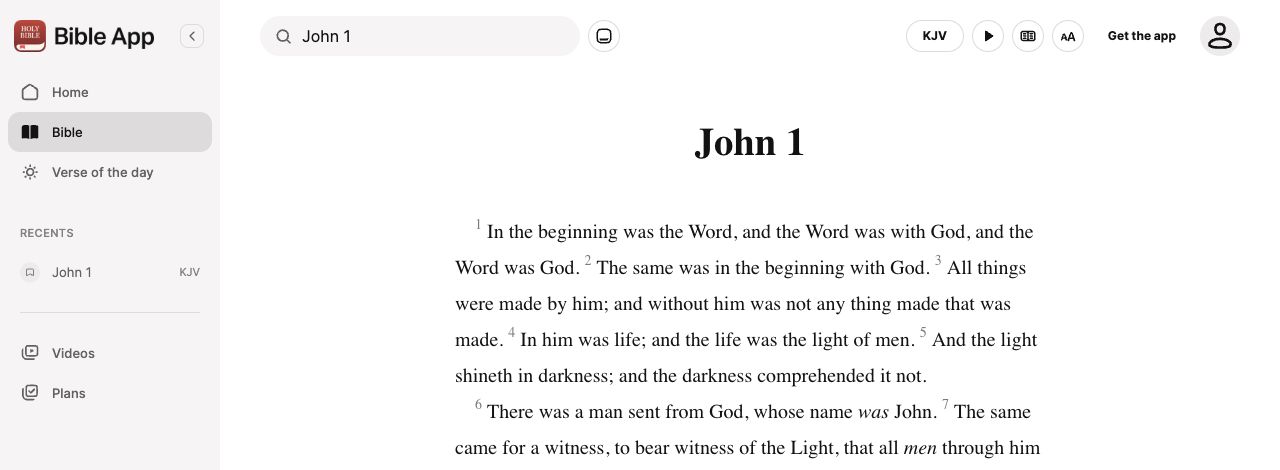
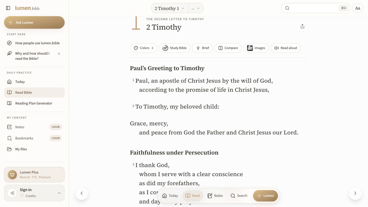
Preserve poetry, headings and translation additions without forcing a rigid layout.
Concrete takeaway
Reflow paragraphs and preserve relative poetic structure.
Choose an approach
These are editorial decision conditions to validate. Some alternatives are successive states or can be combined; they are not always exclusive choices.
| Alternative | Use when | Tradeoff or requirement |
|---|---|---|
| A · Translation addition | The edition marks supplied translation wording | Explain the convention without cluttering every word |
| B · Poetry | Line grouping contributes to poetic meaning | Indentation must survive narrow widths |
| C · Continuous passage | The goal is continuous reading | Verse labels must remain discoverable |
The problem
Small screens and enlarged text can flatten meaningful structure or turn editorial headings into apparent verse content.
The pattern
Reflow paragraphs and preserve relative poetic structure. Distinguish section headings from Scripture. Explain translator-supplied words when the edition marks them. Verse navigation can coexist with continuous prose.
Compare the alternatives
Preserve poetry, headings and translation additions without forcing a rigid layout.
A · Translation addition
An explanation names the editorial role.
B · Poetry
Indentation follows meaning at larger text sizes.
C · Continuous passage
Headings and verse labels support, rather than fragment, reading.
Original wireframe proposals · No live controls · Grey rows represent schematic text, not loading states · Labelled placeholders are not Scripture quotations
Download this wireframe as SVGFailure modes
Shrinking text to preserve a desktop layout; treating each verse as an unrelated box; calling translation additions AI-generated text.
Bible and faith considerations
Preserve the chosen edition’s conventions. A structure standard informs meaning; it does not prescribe one screen component.
What to validate
Test narrow screens, enlarged fonts and spoken output. Can readers recognise a heading, poetic grouping and a translation addition without relying only on colour?
Research-informed design proposal. These visual alternatives have not been tested with users in this atlas. Source findings, documented behaviour and this proposed adaptation are different kinds of evidence.
Sources and adaptation
This card is an original design synthesis. The following sources inform its content distinctions, interaction approach or review requirements; they do not validate the whole pattern.
- Translation additionsMarker semantics reviewed · Translation additions are not AI additions.
- Poetic paragraphsMarker semantics reviewed · Accessible presentation needs testing beyond import correctness.
- Scripture structure documentationRelevant structure and marker references reviewed · A format is not a complete model of app behaviour, annotations or formation.
- Understanding ReflowGuidance reviewed · Some content has defined exceptions; test the actual experience.
Common scenarios and flows
- Move from a focused passage to sustained reading — Support a bounded encounter without trapping the reader inside an excerpt.
Examples in use
Attributed app evidence with dates and review limits. A screenshot illustrates an implementation; it does not establish that the proposal works for every audience.
Design principles in this decision
Editorial application of Missional by Design. These values frame review questions; they do not validate a pattern’s effectiveness.
- Rootedness — Which source and tradition inform this experience, and what meaning or context might this adaptation lose?
Compare alternatives using the task and evidence above. Record competing needs instead of treating a principle as an automatic verdict.