Pattern 53
Parallel reading chooses a useful arrangement
Compare translations without forcing a desktop layout onto a small screen.
Concrete takeaway
Choose left/right panes, top/bottom panes, or alternating edition blocks by the comparison task and available width.
Choose an approach
These are editorial decision conditions to validate. Some alternatives are successive states or can be combined; they are not always exclusive choices.
| Alternative | Use when | Tradeoff or requirement |
|---|---|---|
| A · Mobile: top and bottom | A phone needs readable full-width panes | Stacked panes reduce each visible passage height |
| B · Mobile: left and right | Short comparison fits side-by-side on a phone | Line length may fail with large text |
| C · Large screen: side by side | A larger window supports sustained comparison | Resizing and extra panes need stable reading anchors |
The problem
Two adjacent translations can become narrow columns on a phone. Vertically stacked panes can hide the corresponding verse and make the relationship unclear.
The pattern
Choose left/right panes, top/bottom panes, or alternating edition blocks by the comparison task and available width. On mobile, a top/bottom split preserves line length, while a left/right split can suit brief passages when text remains readable. Offer a single-edition view or switching between editions when neither split fits enlarged text. On larger screens, side-by-side panes can support sustained comparison; let users resize or close panes without losing the reference. Keep edition labels, reference scope and scroll controls visible. Orientation names describe pane arrangement, not the direction in which Scripture should scroll.
Compare the alternatives
Compare translations without forcing a desktop layout onto a small screen.
A · Mobile: top and bottom
Full-width panes share the available height; each retains its edition label.
B · Mobile: left and right
A compact comparison is optional; do not shrink the reading type.
C · Large screen: side by side
Wider panes support continuous reading and a resizable divider.
Original wireframe proposals · No live controls · Grey rows represent schematic text, not loading states · Labelled placeholders are not Scripture quotations
Download this wireframe as SVGFailure modes
Shrinking text to fit columns; assuming landscape means enough space; hiding edition identity; putting one pane behind the player or keyboard.
What to validate
Test portrait, landscape, a large screen, enlarged fonts, a long verse and poetry. Can users identify both editions, change arrangement and retain the target passage?
Research-informed design proposal. These visual alternatives have not been tested with users in this atlas. Source findings, documented behaviour and this proposed adaptation are different kinds of evidence.
Sources and adaptation
This card is an original design synthesis. The following sources inform its content distinctions, interaction approach or review requirements; they do not validate the whole pattern.
- Scripture structure documentationRelevant structure and marker references reviewed · A format is not a complete model of app behaviour, annotations or formation.
- Understanding ReflowOfficial guidance reviewed on 5 October 2026 · Semantic scroll restoration is an original design proposal, not a requirement stated by this criterion.
Common scenarios and flows
- Compare editions across screen sizes — Inspect wording and context while retaining edition identity.
Examples in use
Attributed app evidence with dates and review limits. A screenshot illustrates an implementation; it does not establish that the proposal works for every audience.
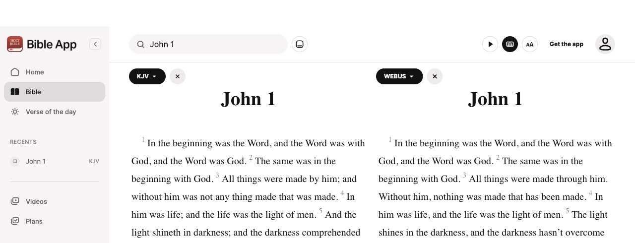 YouVersion · Desktop web
Two editions with independent selectors
Direct web capture · cropped
A study workspace beside the passage
Publisher help screenshot
Three ways to link reading windows
Publisher help screenshot
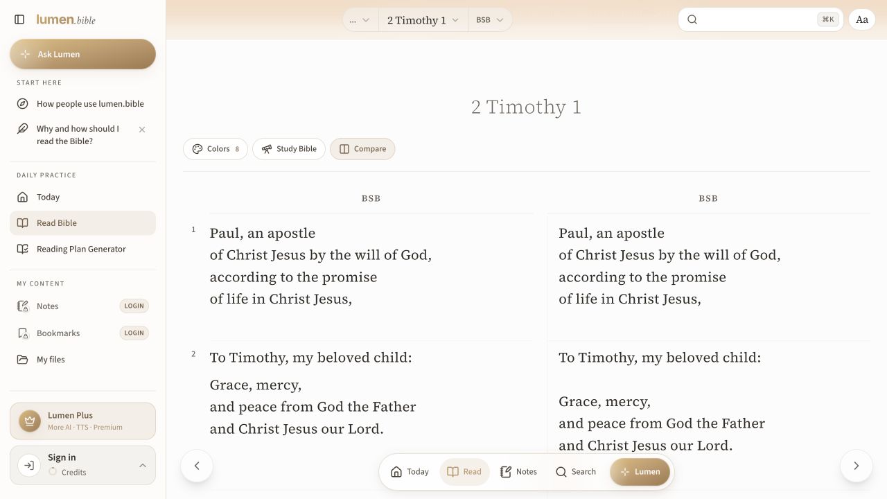 Lumen Bible · Desktop web · English interface
Verse-aligned columns retain different line wrapping
Direct signed-out web capture
Design principles in this decision
Editorial application of Missional by Design. These values frame review questions; they do not validate a pattern’s effectiveness.
- Hospitality — Who can use this approach in their actual context, and what complete alternative exists for someone who cannot?
Compare alternatives using the task and evidence above. Record competing needs instead of treating a principle as an automatic verdict.